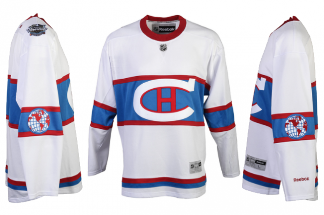
The Montreal Canadiens officially unveiled the design for their 2016 Winter Classic jerseys yesterday, which bring back some old school elements in a simple, sleek design.
“I like everything about it,” Canadiens defenseman P.K. Subban said. “I like the color. I like the globe on the arm, it’s pretty cool, the story behind it, but just the fact that it’s hand-stitched, it’s special, this is like a collector’s item. It’s not just a jersey, in my opinion, it’s a symbol of what it means to be a Montreal Canadien.”
The jersey is predominantly white and features a lighter shade of blue and red trim throughout.
One of the unique features of the jersey is an element that hasn’t been seen for 91 years—a globe with a banner reading “Champions” across it, which was implemented after the 1923-24 season to represent the Canadiens’ Stanley Cup victory over the Western Canada Hockey League’s Calgary Tigers. In the original World Champion sweater, the globe was the primary logo, while the iconic “CH” logo was moved to the arm.
The Winter Classic jersey design moves the globe to the arm and keeps the “CH” on the chest.
“It is a new (jersey), but it’s not a new one,” said Canadiens chief operating officer Kevin Gilmore. “It’s a jersey that basically pays homage to our tradition, our history, whether it’s the ‘CH’ with the white, whether it’s the ‘LNH’ tag that pays tribute to the fact of the French heritage here for the team, so there’s a lot of things that went into creating that look.”
What do you think of the design?