This week the Pittsburgh Penguins unveiled their uniforms for this season’s Winter Classic. This is the second time Sidney Crosby and his team has appeared in the New Year’s Day showcase event. Last time, it was the first Winter Classic where they traveled to Buffalo and played against the Sabres. In comparing the uniforms to the 2008 game, I like the 2008 ones better. They had more of a historical background to it as they were similar jerseys when they first entered the NHL. The jerseys for this year features bits and pieces of jerseys used through their history. I’m not a big fan of the blue striping on the bottom, it looks like I’m getting ready to watch Michael Phelps swim laps in a pool versus a hockey jersey. All that’s missing is flopping penguins inside the striping.
The game is being played in Heinz Field, home of the Pittsburgh Steelers. I would not have complained if they went to a uniform during the Mario Lemieux era when they wore black and gold to play off the colors of the Steelers and the color scheme of the stadium.

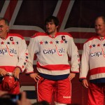
However, I do like the Capital’s uniforms. It does back to the uniform used pretty much until the mid-90’s when they switched over to the flying eagle/capital building logo. The Cap’s went back to the Mike Gartner/Dale Hunter days where ther logo was simple. Washington unveiled their uniforms for the game October 2. Advantage: Washington.
What are your thoughts on the jerseys?
